The Good Company People are a community-based company that focuses on providing good company for people with dementia. I have been working with them since August 2020 to launch their website in 2021. The tools I used were Figma, Miro, Photoshop and Wix. I worked with the branding team to ensure the brand was easily transferred to the digital space.
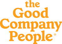
When the site was first launched it was focused on both user groups they expected to use their service. However, after recruiting enough Hosts they wanted to change the site journey more towards the Guests to encourage them to sign up.
To compare the home pages, the original design had CTA's everywhere and it was quite distracting, on the new one there are fewer and they are more obvious where they will take you. The content of the homepage is less cluttered and the information on there is specifically chosen to be of more interest to potential guests.
When the user originally entered the site they were given three possible options for their journey but that has been reduced to two now.
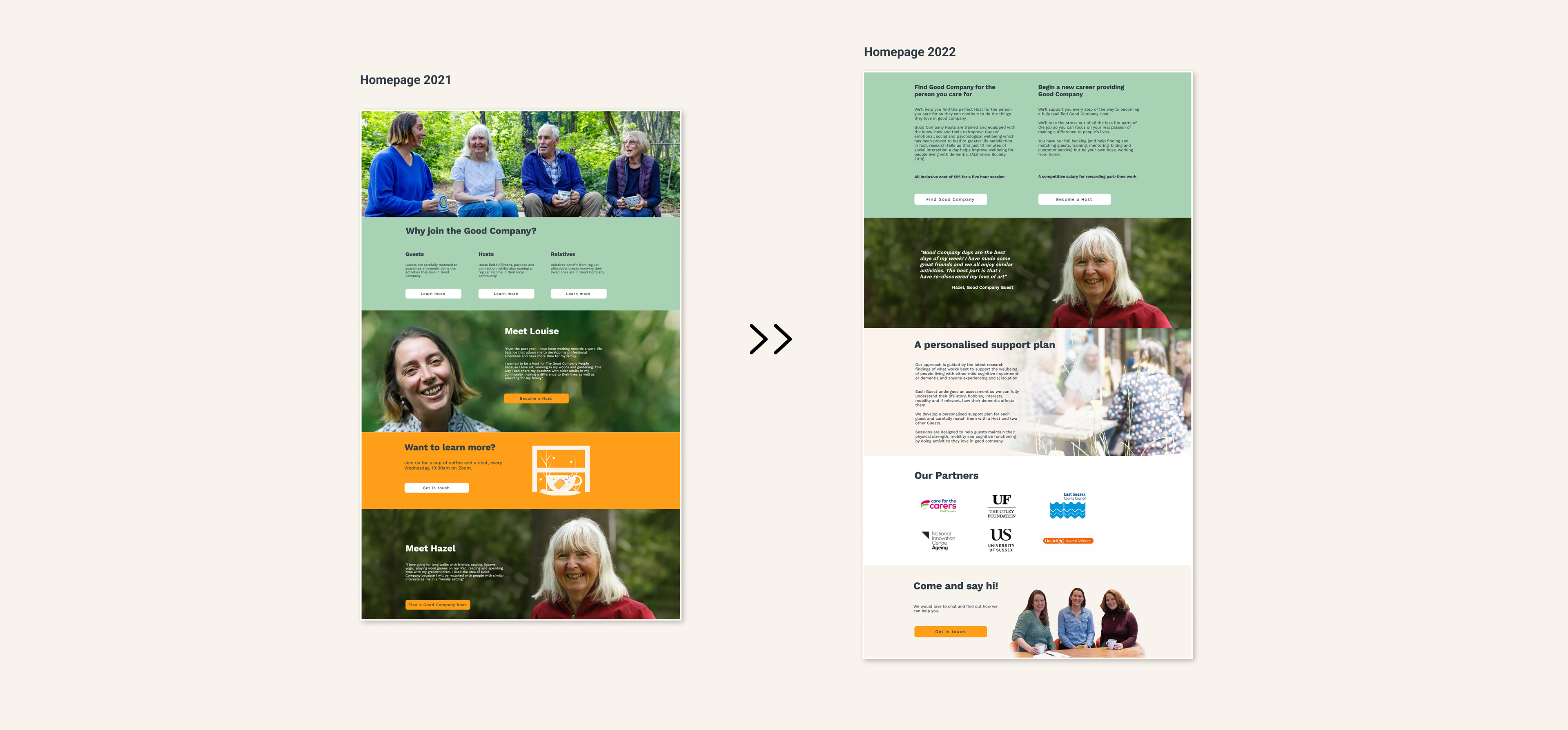
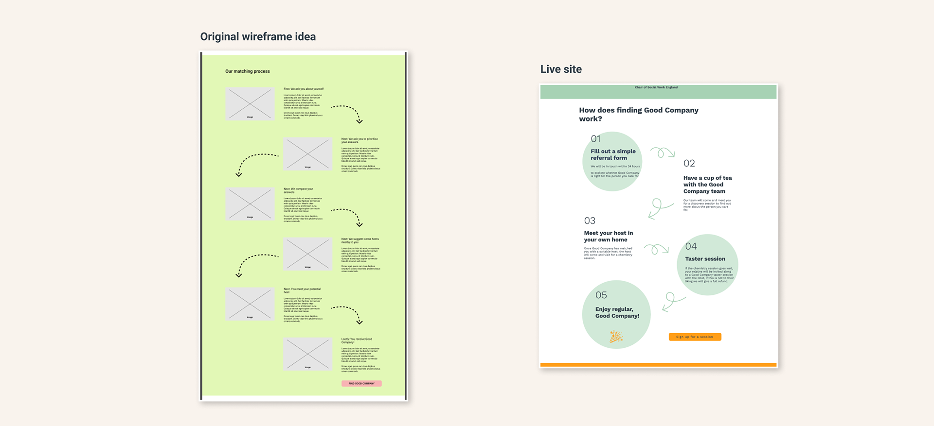
You can see here where I have taken original ideas from my wireframes and included them on the final design:
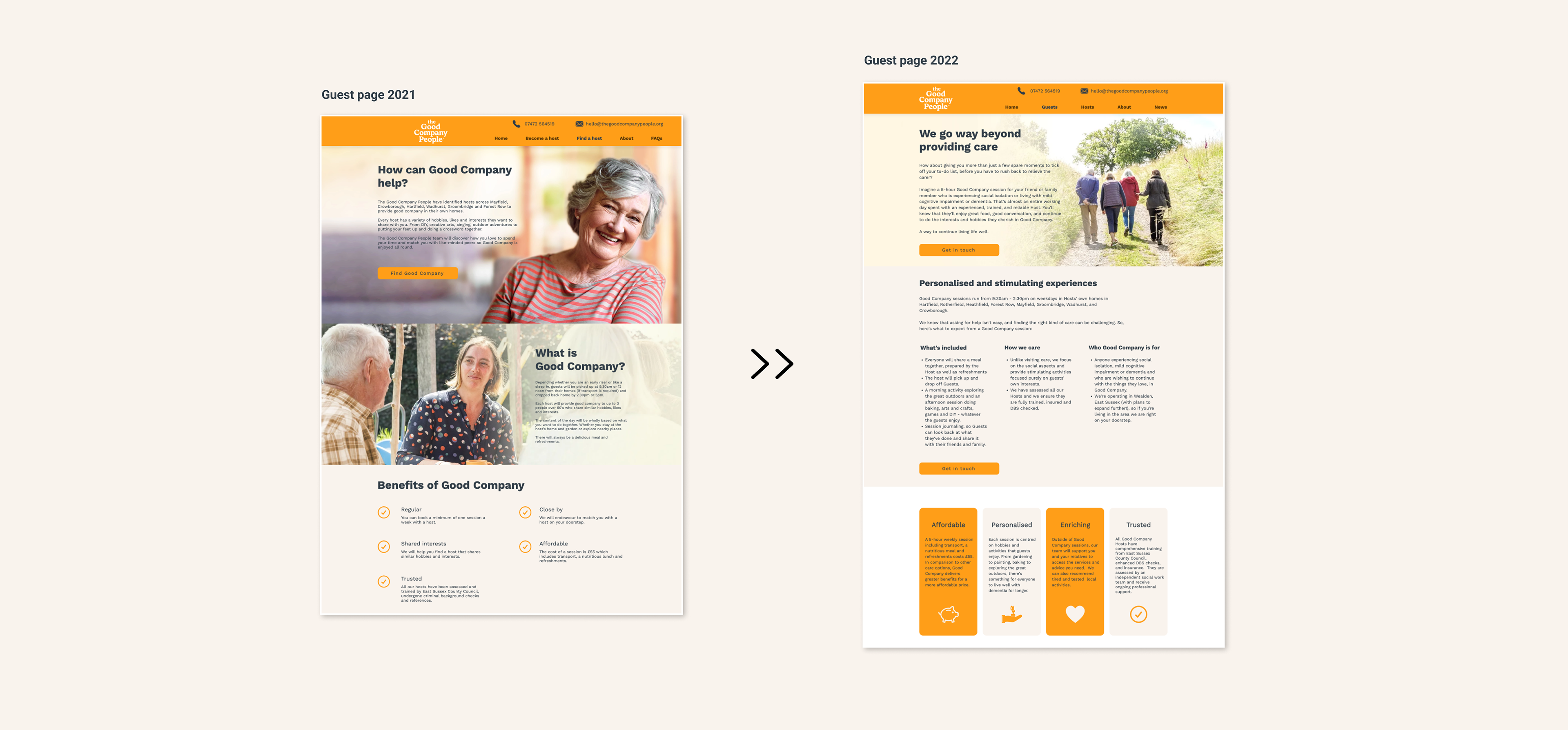
The FAQ's page was removed from the original site but we still wanted to provide the information to our users. I had the information distributed on the other pages so I had to find a way to present it in a digestible way. Below is an example of the Guest page showing how I've split the information up.
Our analytics told us that the majority of our users where using a mobile to access our site. Therefore, as I designed the desktop site I was making sure the design would be able to relate on mobile without making the pages too long because there's nothing good about constant scrolling.
Feel free to explore the site yourself, it can be found here: thegoodcompanypeople